HeartWork Organizing

Helping you find peace and purpose through organization and design

Mini-Kitchen Makeover With Pink Appeal January 26, 2012

Filed under: Color With No Regrets,One Day Interior Redesigns — HeartWork Organizing @ 2:00 pm
Tags: , , ,

More in the kitchen series: Yes, technically a this is also a kitchen, but for very small cooks.  And very pink.

Have you ever seen two little girls play in the Pottery Barn Kids store in the kitchen section?  Let me tell you, I thought I would not be able to get my girls out of there recently.  But for $700, there better be a real stainless refrigerator in that set, right??

Pottery Barn Kids Retro Kitchen

Kitchen Remodel for a Screaming Ugly Kitchen

When I had the chance to pick up a really sturdy wood construction three-piece kitchen for just $10 at a recent consignment sale, I couldn’t pass it up.  But, boy, was it ugly.  Purple, deep pink, and a shade of blue that made my eyes hurt.

Still, I could tell this was worth remodeling.  The girls got to play with them for a couple of weeks, then down to my workshop they went.  There were some details I liked, including the foil burners on the stove…

And some details I didn’t like, as in the unfinished backs and interiors.

Even though it’s miniature, this kitchen paint job starts like any other.  With a simple step, you can avoid this mistake: properly prepare oil paint surfaces.  Use this tip to tell if you have latex or oil paint on your existing surface.

Color Choices for a Super Cute Kitchen Remodel

Then primed, lightly sanded between coats, and rolled on two coats of Sherwin Williams Impatiens Petal SW 6582.  Picking this shade might have been the hardest part of the project, but luckily, I am an expert at picking Color with No Regrets.

It always amazes me how bad the primer coat looks. I’m showing you this just in case you want to paint your real cabinets.  Remember to use a good quality roller and sand in between coats to remove any fuzzies that are left behind by the roller.

I decided not to mess with the attached kitchen faucet on my set, and I saved a few bucks by spray painting the handles a stainless steel finish. There were two different sets of hardware here, but it didn’t make sense to spring for the $20 bucks for new hardware.  Remember, the whole set only cost $10 to start.

Kitchen Remodel: The Big Reveal

I was able to finish and bring the kitchen back upstairs a week before Christmas.  The girls love it.  Last week I thought one of the clients who visits my home office was going to rush over and get caught up in kitchen play when she saw it. I originally wasn’t going to keep all three pieces, but once they were done, the girls loved it so much that the whole set ended up in our living room instead of the play room.  How could we not keep them all?

Santa (aka Nonni) did come through with the actual Pottery Barn tea kettle that makes boiling and pouring noises.  At $40, it cost more than the kitchen and all the remodel supplies together, but it is the splurge that makes our little play kitchen irresistible.

I especially love that the backs and insides of all the pieces are finished now.  Thank you, IKEA, for such cute play fruit. And I love that the kitchen is actually storage as well.  The dishes and food are always stored inside the three pieces.

All in all, for the few hours of work it took to bring this retro kitchen up to speed, I can say that it was SO worth it!  This is a kitchen set that I am happy to have in my home for the next few years.  And I’ve even happier to have “saved” $680 versus the other kitchen.  The girls seem to love it, too.

And yes, in case you are wondering, the painting process I followed here or a cabinet paint product would work just as well for your real wood cabinets, in pink or any other color.


Second Chance Decorating December 21, 2011

Filed under: Color With No Regrets,One Day Interior Redesigns — HeartWork Organizing @ 2:59 pm
Tags: , ,

Everyone deserves second chances, and that goes for good vintage furniture, too.  There’s something amazingly satisfying about repurposing something into a beautiful redesign.  Even if they aren’t old enough to be antiques, they are usually better quality that some items we find on the market today. When there is a chance to give a great piece a second life, and maybe save a few bucks, I’m all over it.

(If you find this post and the blog interesting, please click over on the side on the Subscribe button.  You’ll get fresh posts sent to your email or RSS feeds (your choice) as soon as they are hatched.)

This recent living room makeover is a great example.  If you didn’t see it, check out the wide shots of the room in the December 2011 newsletter.  Here are four of the items in the room, made over to be the perfect fit for the owner’s style.

We spent 6 hours hunting for the perfect sofa.  Would you believe we found it?

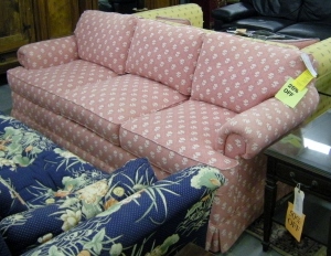
Slipcovered sofa before

Are ya lovin’ it?  Trust me, despite the very, very pink exterior, the interior of this sofa is wonderful.   Full of feathers and the most comfortable sofa I’ve sat on in ages, the client got a steal at just $125.  Wanna see the after?

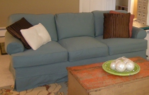
Slipcovered sofa

The beauty, of course, is that frame will likely outlast the slipcover, which can be changed in the future.  But it can also be washed, if need be.  Your regular  showroom sofa can’t pull that trick.

Then we we found a few other funky items, one of which captured my imagination.

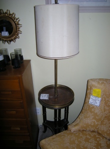
floor lamp needs a makeover

This floor lamp has bamboo-styled legs, which is a detail that I love in small doses.  But the brass trim was beaten up and the shade was a complete wreck.  Would you look twice at this beauty?

Chic black bamboo lamp

Several coats of black enamel were all it took to restore this lovely lamp.  Did I mention she was only $20 bucks to start?  And now nestled between two gorgeous, colorful and comfy chairs, she’s the perfect lamp table for the reading nook.

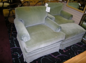
Here’s another transformation waiting to happen.  When I found these two club chairs and matching ottoman for only $150, I didn’t let the little bit of surface wear and ink stains throw me off.  You know there is a color change coming, right?

Club chairs waiting for slipcovers

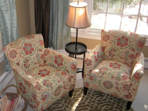
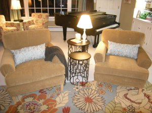
With my favorite instant makeover tool, high quality stretch slipcovers, and a bit of work in the background, these “new” chairs fit right in.

club chairs with slipcovers

The last of the second chances I’ll show you here is a bright pop of color.  With just a teensy bit of repair, we repurposed this old chest into the room’s coffee table.  If I told you I was bringing a beat up old orange trunk into this room with a grand piano, would it make sense?  But this one, which once might have been a foot locker or fishing tackle storage for all I know, looks right at home in this warm place for one of my favorite families to gather.

I hope you enjoyed seeing these items we used in this second chance decorating project.  Are there vintage items in your home or at your local thrift shop that can be fabulous with just the right touch?


Lighting Matters When Decorating November 29, 2011

Filed under: Color With No Regrets,One Day Interior Redesigns — HeartWork Organizing @ 2:00 pm
Tags: ,

A friend and I are picking items for her new kitchen, and we were reminded again today to use the one criteria most taken for granted-lighting, anywhere and everywhere.

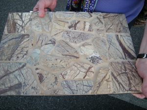
Outside lighting on a kitchen backsplash

My friend, I’ll call her Celia, did a great job of picking seven different floor samples to take home to try out. On her way out of the store, she spotted the perfect, to die for, colorful tumbled stone backsplash (see photo above). I cautioned Celia that she was seeing her picks in a huge warehouse store with terrible fluorescent lighting, and they were picking up colors of samples around them, not the colors they will be picking up in her kitchen.

The minute we walked out of the store, we saw all of the samples turn shades. Eew. Some of the items went pink, some went orange, some of them lost their color altogether.

A few hours later, I got an interesting email from Celia. Her colorful stone backsplash went drab at home. The darkest floor tile sample that was sure to be rejected in her light-starved kitchen turned out to be her most favorite and most colorful.

Was this shopping trip a failure? Not at all. We have options to improve the lighting that will restore the shine and color to the backsplash, and we both agree that it still reflects her style. And by spending that time in the warehouse store looking at all available samples, Celia has also zeroed in on qualities for the floor tile that previously knocked out several contenders.

So next time you are shopping for decorating choices, watch out for big spaces, bad lighting, and snappy judgements. Take samples home and see what they say to you in the lighting where they will live. Let me know how it goes.


The Science of Halloween Colors: Orange, Purple, Green October 29, 2011

Filed under: Color With No Regrets — HeartWork Organizing @ 11:45 pm
Tags: , ,
Would You Decorate with Purple, Green and Orange Year Round?
Quick, what colors do you think of for Halloween? Start with orange
for pumpkins, of course, fall leaves, and candy corn.    Then purple.  Add
green.  We see it all the time.  This little assortments was in my daughter’s
goodie bag from school this week.
Halloween Color Triad
OK, so orange, violet and green are traditional Halloween colors, but
there’s more to it than that.  It turns out there is a scientific reason that we
put these colors together.  They are a color triad.  In other words, they are
found equidistant from each other on the color wheel, which is usually shown as
having twelve positions, or slices of the pie.
We usually see the “loud” version of this for Halloween decorations,
with very saturated color choices, as in the picture above.
But consider these things…
When these colors (or any other triad, for that matter) are used in
different proportion throughout your house in different rooms, your house will
read as a colorful and thoughtfully decorated home.  You can see this at work in
a home I had the honor of redesigning a few years ago.
Orange living room
Violet bedroom
Green office

You may have seen these photos before, because I was so happy with the collaboration
between the client and I, but now that you see the photos together, you can see
that the color choices are a natural triad.

If these colors are too bold for you, check these out.  They are all variations on
the orange/green/purple theme, believe it or not!

color choices based on Halloween triad

Did you notice that the two sets of colors on the right are the exact same colors,
but shown in different proportions?  If so, give yourself a star.

We could go on and on about the fun you can have with tint and tone, proportions,
accent colors and the fact that even neutrals have colors, as in the lower left
samples above.

I hope all of this gives you a new eye for color.  If not, you know where to find me.

Ya know, the holidays are coming.  If there is any tweaking you’d like to do your
home or office, please call me soon!

color combos above, all from Sherwin Williams and
available in Duration Home paint:

Top left:

6624 Peach Blossom/6709 Gleeful/9822 Wisteria

Bottom left:

6064 Reticence/ 6150 Universal Khaki/ 6260 Unique Gray

Right samples:

7707 Copper Wire/7742 Agate Green/ 7579 Alaea


White is for More Than Winter Wonderlands January 27, 2011

Filed under: Color With No Regrets — HeartWork Organizing @ 2:51 pm

The entire Northeast was covered in a blanket of white today.  Backyard and sidewalks are all camouflaged.  Everything looks bright and crisp, while at the same time having softer edges and a unified look.  Wait, that might describe your goals for your next decorating project.  While the trend in today’s homes is definitely toward more color, white still has a place in modern decorating schemes. 

There are many reasons to love white.  A white bathroom or kitchen is easy to clean and can sparkle with little effort.  A base of white finishes, including tile, walls or upholstery, is a great starting point for adding layers of color.  White slipcovers are easy to wash and stand up to even kid traffic.  White can be the canvas on which just one striking color or an arrangement of photos is allowed to shine.  While it may seem like a safe decorating choice, it is also an economical one when outfitting entire spaces or projects, since smaller accent pieces can be swapped with ease.  While colors go in and out of style, white is always in.

Here’s something you may not know.  There are as many shades of white as there are colors.  A true white is very hard to find and almost every white item you’ll fall in love with has a hint of one of the 12 colors we associate with the color wheel.  That means that some whites are “cool” while some are “warm”.  Often, you might find an accessory or paint choice that you think is really white, until you hold it next to its color match, where you see the hue in the white more clearly.  These very light versions of color are called “tints”, which is the term used when white is added to a base color.

Mixing  a very small amount of color to a base can of white paint  is an economical way to get a good match for trim or ceiling paint, if you prefer not to have a bright white ceiling.  Treating a ceiling this way can make an entire room more cozy and intimate in a very subtle way.

Mixing whites is completely acceptable, and even my be appropriate, depending on your decorating goals.  One of my favorite secrets is using painted furniture with a history.  The term used to be shabby chic, but that was overdone with pinks and lace, and now we’re more likely to call a comfortably worn setting vintage.  You can visit one of my favorite places to shop, Vintage Home,  and see what they think about whites. 

When using white in your decorating scheme, remember these tips:

1.  Decide whether white is your base, your accent, or a vehicle to accent some other feature in the room. Allow yourself to bring in colors until you reach the look you want.  Normally we see a bit of white just in the clouds or in flowers, but today white is the star color, completely covering evergreens and entire dark roofs. 

2. A single color (or non-color, as white technically is considered) can unify objects of different sizes and shapes.  Consider painting furniture and accessories the same shade to make them more visually appealing. The entire town looks somehow more calm and unified today, sharing the same blanket of snow.

3.  There is no such thing as too clean.  Some household items never seem clean, but there is no mistaking  sparkling clean white tile, towels or toilets.  It’s easy to love the new-fallen snow, until cars and ploughs gunk up the edges.

4.  White and black can coexist in the same room.  Both are considered neutrals or achromatic choices.  You might notice today that the snow makes certain trees you might never notice stand out from their surroundings. 

5. Finish counts, too.  A glossy finish will have a different appeal than a matte white.  The purpose of the room and the piece will determine the finish.  For example, paint trim a gloss white to make it stand out from matte white ceilings.  It will be a subtle choice that still highlights a feature.  Keep those sunglasses handy, because just a bit of sunshine will reflect more today than we usually see this time of year.  Get outside for a few minutes and see if you can’t get those vitamin D levels up. 

6.  Paint last.  If you are making other updates, such as adding plantation shutters or buying new bedding, be sure to match or coordinate your white paint after you’ve chosen your products.  You can always mix the right shade of white; you can’t easily change the color of a manufactured product.

Enjoy your snow day.


The Perfect Color in 60 Seconds: Make Color Decisions with No Regrets November 30, 2010

Filed under: Color With No Regrets,One Day Interior Redesigns — HeartWork Organizing @ 12:58 pm

Would you like to know how to hone in on the perfect color in minutes instead of hours? Instead of agonizing over the 1000+ choices in a paint deck, you could narrow it down quickly and correctly every time with the patented Color with No Regrets System. Darla DeMorrow, owner of HeartWork Organizing located in Wayne, PA, now offers “Color with No Regrets” through a patented selection color process.  DeMorrow has earned the distinction of becoming a CCNRC (Certified Color with No Regrets Consultant), which is a designation held by less than 1000 people in the world.

The patented color selection system was created by JoAnne Lenart-Weary, industry expert and founder of The Decorating and Staging Academy, along with Cyndie Stefanik, a 20-year decorative painting veteran and color guru.  They have been featured in magazines, HGTV and on a weekly segment on local ABC affiliate, WJET-TV.  The patented Color with No Regrets System is based on the science of the color wheel and combining levels of color intensity to create perfect harmonies for a client quickly and effectively.   The process begins with a quick color test that helps the client to hone in on the palette appealing to the client. 

“Most people start the color selection process by asking the question, what is your favorite color?” says Lenart-Weary. “We have found this question does not truly communicate the client’s preferences.  For example, if a client states blue, each of us would visualize a different blue. The color test helps the color consultant hone into the perfect blue.  The end result is the CNR Perfect Palette.  This is color selection all about the client and not the decorator.”

“Color is a significant element of the decorating process and also the most intimidating,” said DeMorrow. “I have a responsibility to my clients to be the best I can be to help them create the space of their dreams. This certification helps me offer mistake-proof color selection to my clients with complete confidence.  Whether you are paying a painter or spending your own time on a project, getting color choices right the first time can save you time and money.”  HeartWork Organizing specializes in creating beautiful homes on any budget. Some of the services they offer are professional organizing for homes and offices, one-day interior redesigns, home staging for real estate sales, and space planning, but each of them begins with fail-proof color selection, resulting in a room people love with a price tag they can afford,” explained DeMorrow.  “My happiest clients are the ones who, because of the Color with No Regrets system, feel their homes reflect their tastes by using their favorite colors and belongings.”

The holidays are traditionally all about home, hearth, and coziness.  Those who are bitten by the decorating bug or are planning for spring projects can contact HeartWork Organizing now for holiday gift certificates for color consultations.